Wednesday, 28 April 2010
Sunday, 18 April 2010
More complete scene 1...
With the added background colour I made from dye and oil pastels, the character walk cycle refined and the cloud drawings replaced with sumi-e brush clouds I think this result looks pretty good! The detail of everything seems to make the grass, which the character is walking on, stand out...and that's standing out in a bad way!
Unfortunately time is running very low in supply for me so I'll have to prioritise more animation before going back to this scene and re-drawing the grass! I'm about a quarter of the way with my rough animation - it's a tough job but I signed up to do it :)
Yay...3 weeks left?
Unfortunately time is running very low in supply for me so I'll have to prioritise more animation before going back to this scene and re-drawing the grass! I'm about a quarter of the way with my rough animation - it's a tough job but I signed up to do it :)
Yay...3 weeks left?
Wednesday, 14 April 2010
Scratch animation test
So I'm still kinda unsure about my animation methods which is quite frustrating...I have in my head the idea that I will work efficiently by first animating roughly in Toon Boom, exporting all the images, tracing over the images with the custom sumi-e brush in Corel Painter, then compositing all the finished elements into Toon Boom Studio or After Effects...
That sounds like a lot more work than it seemed in my head ;_; I think I'll run out of time but if worse comes to worse I'll just polish up the animation drawings directly in Toon Boom Studio. The line work in the film "Le Papillon" looks like brush lines but at the same time it looks so clean and crisp rather like vector animation. I should able to experiment with the pressure sensitivity of my tablet and the vector brushes to create a similar brush line to "Le papillon" but it will not look as organic as the Painter brush.
For now, here's the first scene of the film animated in rough - there's slow panning clouds, wind-swept leaves in the foreground and a walk cycle. It looks a bit sparse at the moment (since it's so incomplete) but hopefully after a bit of work here and there it'll begin to take shape properly :)
I may or may not stretch out this scene so that the title appears at the beginning in the clouds...
Friday, 9 April 2010
Final Storyboard
Finally completed the storyboard and I am a lot happier with it :)


Saturday, 20 March 2010
Dissertation...
No new updates for now. The final major project is on hiatus until I finish my dissertation followed by a well earned short break for Easter and a couple of days celebrating mine and Todd Crawford's birthdays. I will be storyboarding here and there after my dissertation is printed, bound and handed in and when that is finished I shall post it up here :)
Sunday, 14 March 2010
New directions...
I know it is very very close to the deadline but somehow I have got myself stuck in a rut...I find it very hard to motivate myself to do more animating when I've somehow lost all my passion for the film. This final major project has been problematic from the very beginning and the pressure of having to make a good graduation film seems to sap all the fun out of it. NOT GOOD!
Also, my testing of the animation tools in Corel Painter didn't go so well...I spent a fair few hours animating and then for some reason when I scrolled through the frames the layers from each frame piled on each other making the brush strokes look heavy, pixellated and lost all transparency. I don't really know what happened but I think I will stay away from this animation tool before I waste any more time, effort, work, blood, sweat and tears...
Before flipping through frames:
 After flipping though frames:

The problem lies in the fact that you can't save a file in framestack [animation] mode - it auto saves so any changes that can't be undone (like this one shown and described above) can not be changed back. It is quite frustrating...I think I made a mistake somewhere by not merging the layers after completing each frame...but I like having layers as it allows me to go back and fix mistakes.
As a result of this setback, I have taken many walks outside in the sunshine to clear my thoughts and give me some new inspiration. I think it has worked, It is a bold and risky move but I have decided to re-script my film and I'll also re-storyboard the film. If I can complete the storyboard then being able to see the end might act as extra motivation for me.
For now, here's the new and final script. Yes, it is definitely the final one now because I don't want to go back to tan early stage again; especially with so little time left. My justification for this move is that I am much more happy with this new script than I have ever been with any of my older ones. I also feel that I have simplified the animation job meaning things will be easier for me in the long run. Just need to storyboard, then animate like I will die if I don't, to get this all finished for the hand-in date. FUN!

Also, my testing of the animation tools in Corel Painter didn't go so well...I spent a fair few hours animating and then for some reason when I scrolled through the frames the layers from each frame piled on each other making the brush strokes look heavy, pixellated and lost all transparency. I don't really know what happened but I think I will stay away from this animation tool before I waste any more time, effort, work, blood, sweat and tears...
Before flipping through frames:


As a result of this setback, I have taken many walks outside in the sunshine to clear my thoughts and give me some new inspiration. I think it has worked, It is a bold and risky move but I have decided to re-script my film and I'll also re-storyboard the film. If I can complete the storyboard then being able to see the end might act as extra motivation for me.
For now, here's the new and final script. Yes, it is definitely the final one now because I don't want to go back to tan early stage again; especially with so little time left. My justification for this move is that I am much more happy with this new script than I have ever been with any of my older ones. I also feel that I have simplified the animation job meaning things will be easier for me in the long run. Just need to storyboard, then animate like I will die if I don't, to get this all finished for the hand-in date. FUN!

Monday, 8 March 2010
Visual tests
I've been messing around on Corel Painter trying to get a suitable brush - after messing with the brush settings and making scribbles for a few hours I have finally found a very nice configuration! At times I feel it's far superior to a real brush (in my hands) but at the same time it can be more difficult to produce certain lines compared to a real brush. I have to adjust my pressure, tilt and velocity very carefully to achieve the right look. All things have to be considered for each line - the smoothness, the varying thickness, the parts that emulate the look of stray brush hairs and also the transparency - emulating when the ink of a Chinese brush runs lower towards the end of a stroke.
Taking some images from the storyboard I have created some mock stills which might eventually become my final layouts. I am also falling way behind schedule! But it's all good since I'm making progress :S
Here's a drawing of the graveyard at the beginning:
 A background drawing for when the woman kneels at her late husband's gravestone:
 A test for how the character would look drawn with the digital ink brush:
 The front door from inside the house (notice the different colour background because the setting is now inside?):
 A drawing of the female character from front view (also a scene from the storyboard) - there are some proportion issues concerning her jaw line but I think the hair looks good...
I need to get a move on with this animation - I have recently discovered that you can actually animate directly into Painter! If I can get this to work then I'll essentially cut my work time by half which I like the sound of. However, I'm concerned that it's not a well-known or obvious choice of program for animation which might mean it's not very good :S I'll give it a go anyway!
Friday, 5 March 2010
More bit of storyboard...
I noticed in my last post that I mentioned the photo-breaking scene. You would not know what the photo breaking scene is...because I had not posted the storyboard of that part of the film...because I hadn't drawn it the time I posted the other part of the storyboard. So here it is!


Actually...I remember now there was the introduction of a photo-breaking moment in the last animatic I posted. Oh silly me! But still, I should keep this blog up to date with the latest bit of the [current] storyboard.
Essentially, what happens in this last part of the film is that all the reminders of her dead husband drive the woman to a swirling pit of despair. She goes around breaking all the photos - photos that bring painfully happy memories and serve only to remind her of what she has lost. As the broken photos accumulate, the ghost of the husband starts to fade - the destroyed photos=destroyed memories=destroying his soul [somewhat]. I'm still unsure what to do with the end but hopefully as I animate I'll get into the flow of the story and find inspiration to complete the film. It's a bad way to work if I was in a group but as a lone artist I think it'll work out! I hope...
Thursday, 4 March 2010
Some new ideas
I didn't really have a chance to finalise a visual style for the film which is rather shameful especially so late in the project! Now, I am pleased to say I've almost got everything sorted and there will be more polished looking mock stills to come.
The aesthetics; I am aiming to have a very hand-made organic feel to them. In my opinion a lot of animated films these days lack a little magic because they are over-rendered or too clean and smooth and lifeless due to the availability of computer programs. There's something about a lot of new digitally made animations that appear cheap, rushed and mass-produced which is a shame because the digital tools were created to allow animators to work more efficiently and economically. This should have potentially led to even more amazing looking animations but made in less time and although some people succeed...it also means too many people cut corners to make bigger profits...
Anyway, I got a little sidetracked! The visuals will consist of very minimalistic backgrounds and I will aim to de-clutter each scene to depict only what is essential - this is the key rule for artists who practise Chinese brush painting and Sumi-e. The details will all be drawn in black [digital] ink on lightly textured backgrounds.
These backgrounds were made by first staining cartridge paper with dye. When dry I layered several colours of oil pastel over the dye and then, with a paper towel dipped in a solvent, I blended all the oil pastels to produce a richly coloured and textured surface. I feel that it adds a lot of character to the film's visuals and helps a long way in achieving the organic feel I want.
I plan to use only three colours in the entire film: blue (above) for the scenes that are set outside in the graveyard.

This pink-ish shade will be used for the flashback sequences since it is a somewhat sentimental colour which gives a warm but dream-like atmosphere.

This brown shade will be used for the scenes set inside the couple's house - it has that homely warmth yet slightly nostalgic tone which I find appropriate for what was once a loving home.

For fun I have thrown in this background colour - I played with the idea of using it in those really violent/angry scenes in the breaking photos sequence but it is a little too strong and fierce a colour. Whilst typing this I had a slight change of heart...maybe I'll end up using it?
Ehhh...maybe not...
Sunday, 28 February 2010
Storyboard version...5...I think!
I've made so many bits of storyboard here and there that I don't even remember how many I've actually done! However, I do know in terms of what I worked on for longer than 10 frames...my handed-in storyboard for module 1 was my fifth :D
Here's storyboard version 5!

Yes, it is unfinished :( - It just seemed to go on and on and on...which makes me somewhat concerned for the length of it! Unfortunately, despite spending a good week on this storyboard I have decided to scrap it again. It feels like wasted work but I like to be optimistic and think of it as a step in developing my final story.
A good thing that has come out of my frustration is that I've decided to employ a different way of working to what I've been doing up to now. After a brief discussion with Leonie she suggested that I make my final film similar to my documentary film from my first year. Now, I have longed to make something like that and it's been in the back of my mind throughout working on this final film. The difference between then and now is that I've sunk into a pit of conventional working practices and expectations. I remember everything was done very spontaneously for my documentary and there was no proper structure until I animated everything and composited it together. It's a gamble but I'm willing to give it a go for my final film too. From now on, there will be no structure until it is finished. Not something I would do if I worked in a group on an industry standard film, but as an artist working alone I think it will be very effective and I hope it will produce something I'm proud of.
Saturday, 27 February 2010
Oops...
I just noticed I have not been working on the character design for the male! That's pretty terrible...but I can only justify this by considering the female as a more lead role in the story :) If there is more screen time for the woman then I think she deserves more effort in her design! :P
Also, as I mentioned before, I find it a lot easier to draw women and therefore I'll pick up my drawing skills a lot faster. Not to mention that I'm feeling quite uninspired as of late so I can't bring myself to draw a man since it's so much more challenging for me...but maybe that's what I need to be doing...challenging myself...hmmmmm...
Character designs Part 2
Here's some more progressed character designs - I wasn't too satisfied with the designs I did for the hand-in and I have reservations with regards to the visual style. Here, I've experimented a little bit with visual styles but essentially I've gone for some quite detailed designs. They didn't take very long and are very easy to replicate but look more complete than the other designs.

I rather like the drawing on the bottom middle so I developed that design a little further. I also really like the simple drawing above it because the design is so clean but the variation of the brush lines' thickness gives it more substance.
 The character is getting there I think - I like the ease of drawing a simple bob haircut. It's a simple enough shape that I can draw it quickly but the loose hair also means I can be more interesting with the animation by making it move with actions or in the wind.
 Here, I'm trying out the use of more thick brush strokes and forgoing the use of a thin line pen. I think the style is also looking much more refined and I think it'll look very good animated :). The more expressive brush strokes add a lot of movement to the images even though they are static right now - it should help the animation along I hope!
And here, I wondered about going a different direction with the character's design but pretty much completely altering her appearance. I really really like the design but I had such a hard time drawing all those curls in her hair I think it's best to stick to the previous design!
Friday, 26 February 2010
Playing Catch-up
For a while I was still very unsure of what I wanted to do with the story so I thought it'd be good to take a break and work on some concept work or at least practice drawing since it seems like an age since I drew things properly. It's terrible!
To start with I looked through an old hairstyle magazine to look for pictures of people - these magazines are very useful reference!From some chosen photos I made some line drawings in a stylised manner hoping to create a cool visual style for my final film and at the same time, learn to draw women's faces since my film is so character-driven.
First, I simply used a pencil or pen to do rough sketchy drawings - I'm rather pleased :)
Then, I decided to be a bit more WILD and got out my paintbrush and black ink - I intended to use a heavy brush stroke style after all! Here, the shape of the hair and the direction of the locks were all done very quickly with brush and ink then the facial details were added with pen. I like this style but I'm not sure I can emulate it as effectively digitally.


Then, I decided to be a bit more WILD and got out my paintbrush and black ink - I intended to use a heavy brush stroke style after all! Here, the shape of the hair and the direction of the locks were all done very quickly with brush and ink then the facial details were added with pen. I like this style but I'm not sure I can emulate it as effectively digitally

Stay tuned for character designs!
Sunday, 21 February 2010
Time Warp!
Woooh it's been a little while hasn't it? Well, I got my grade back for the first module and I'm very very pleased. I'm disappointed in myself for not producing concept artwork to hand in but good news is that I HAVE been working on some. It is rather difficult to create a suitable and established style that I can easily reproduce and yet won't take too much time (so faster for animating too!)
I created a new storyboard AGAIN and then made a half-animatic...AGAIN! But then scrapped it...AGAIN! It's horrible being in such a cyclical pattern...thinking I'm out of it then realising I'm still in it! Well...then for the hand-in I made ANOTHER storyboard which I find is better than the others but the story needs some cutting down...but there'll be some changes AGAIN.
I took a long walk today in the beautiful sunshine and refreshing breeze to think through things and have been re-inspired by a few things I have watched/read/listened to in the not so distant past.
more updates to come soon! :)
Friday, 15 January 2010
Rough Character Designs
For the hand in of my preproduction module I submitted some very very very basic character designs. As a result of my running around in circles trying to refine the story (or more like recreate a better story) I didn't get very far and I personally find the designs very weak :(
Here's some rough initial design ideas for the two characters - yes I know, some of them are rather bizarre-looking! At least it shows I'm open to try something really new and different.
 I think these designs are more suited for a different animation style (clean, thin lines and cel-style colouring?) so here's some more simplified designs with smooth, flowing lines better suited for animating with brush lines:
 I love how the hair moves in the drawing on the far right - I can imagine it looking very expressive when fully rendered out as a mock still. However, I'm still not entirely convinced with the designs so next I tried merging the more complex sketchy designs with the simply smooth designs to create this:
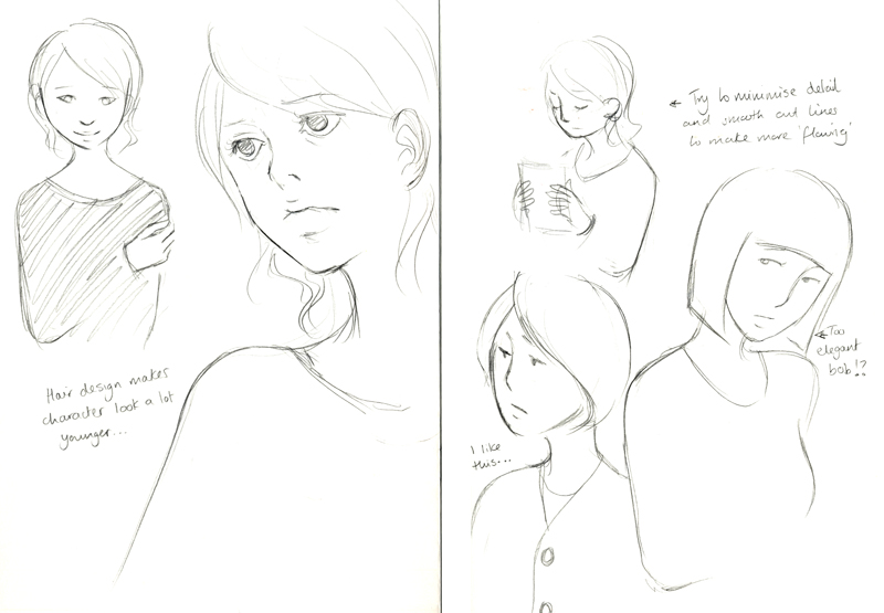 Accidentally, I drew something which I'm somewhat happy about...I think it was the heavier hand on the pencil giving a stronger and more expressive line to the drawings. I took the bottom, middle design and drew them out again, this time being more passionate with my pencil:
 I think the stronger and more expressive line really helps to bring the character to life - I may invest in some brush pens to try more sketch designs with a closer aesthetic to what I'm aiming for in the final film. After all, I'm not looking to do a pencil animation! I'm settling for this design for the woman character for now...onto the male character design!
 I enjoy drawing females a lot more than males so I noticed I put more effort in designing the woman...which isn't very good since I always had the idea that the male character is the starring role...I think I might change that around since I find it more fun and easy to draw females! I prefer the design for the male character on the right and obviously it has a more suitable style for my animation but I think he needs a little extra spice!
Subscribe to:
Comments (Atom)